Doors II

In a well-designed house, attention is paid to every detail - architectural style, room size and layout, windows, doors, casings and moldings, etc. All of the details work together to create a functional and attractive home. Occasionally, though, some details might not be as well thought through, or perhaps budget constraints require the substitution of elements that are less expensive or more easily obtainable. These elements can detract from the overall design. Although they may not be noticed until after the house is completed, they will become evident in time. You may have seen this for yourself ( “This window does not relate to the style of the house,” or, “Why did they put a cheap light fixture in this lovely foyer?”).

Such was the case in a client’s home in Shaker Heights. We were redecorating the master bedroom when it became evident that the problem could not be ignored. On one long wall there were two large closets, each of which had two very plain hollow-core doors. As we focused our attention on the other surfaces in the room - lighting and soft color for the ceiling, a new rug on the hardwood floor, and tone-on-tone stripes for the walls - the plain doors became an eyesore in the space. The doors functioned well but they would have looked so much better if they had some kind of texture, such as paneling.

I had the idea to paint a trompe-l’oeil finish on the closet doors. “Trompe-l’oeil” means “fool the eye” and it refers to a visual illusion, created by painted details which look as if they are three dimensional. Fortunately I know a very gifted painter named Keith Smith whom I could tap to do this transformation. He painted “panels” on the closet doors and it was just the amount of detail required to complete the bedroom’s design.

My client and I were so pleased with the result that we decided to add the faux panels to other hollow-core doors in the house. At Keith’s suggestion, different styles of paneling were used, just for a little fun. Guests are delighted at the sight of the doors, and I am happy that we could change what was an eyesore into an asset.

IMG_3059.JPG

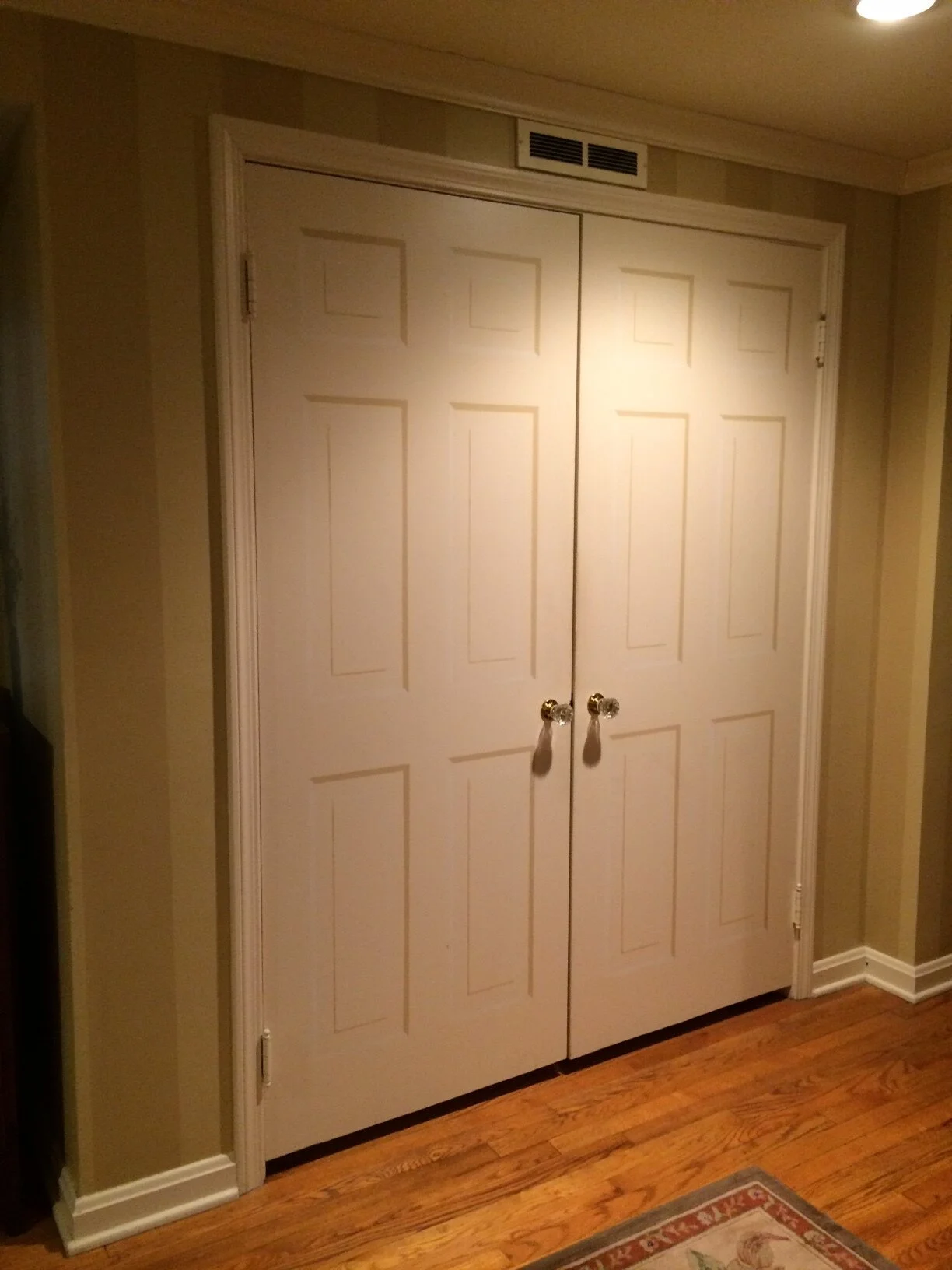
One set of closet doors in the Master Bedroom with faux “paneling”

IMG_3063.JPG

Faux “panels” on the Master Bedroom door

IMG_3064.JPG

Another bedroom door with faux “panels”

IMG_3074.JPG

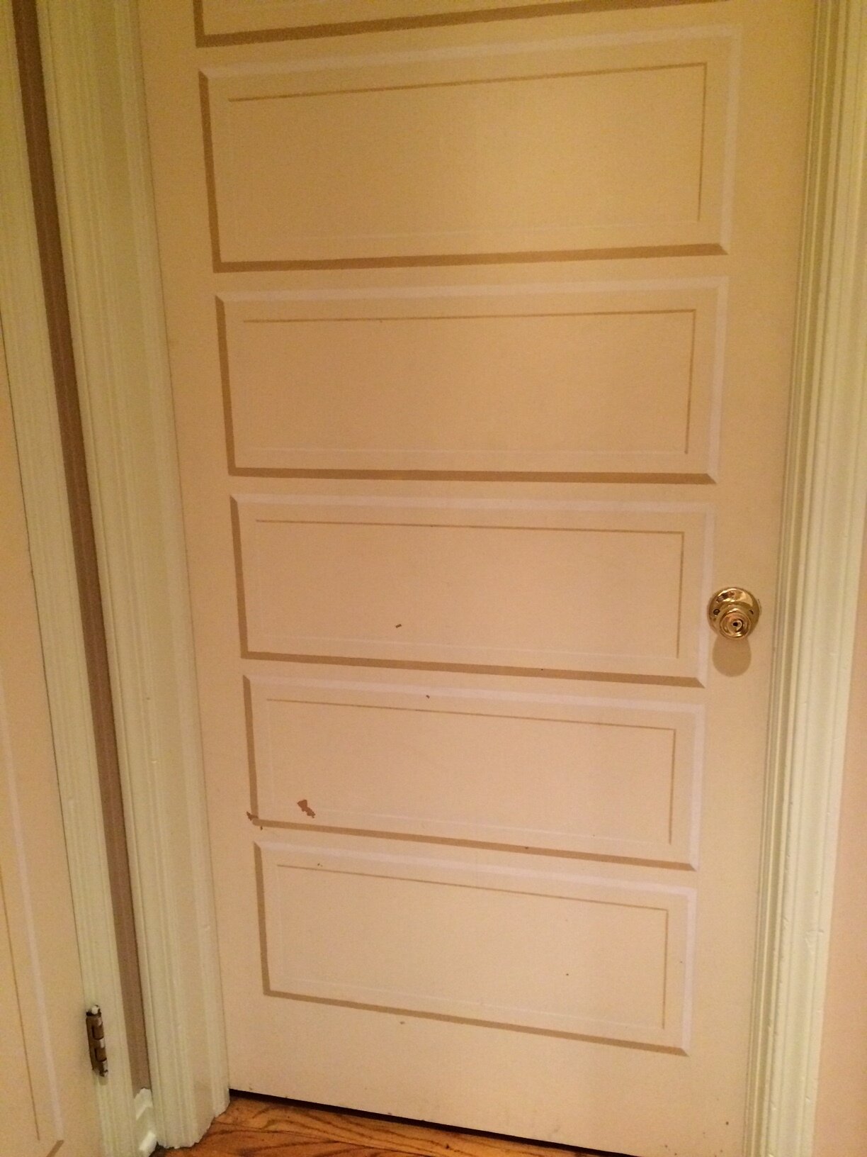
This door wears a different style of “panels” - a nice surprise!

Doors I

Carefully considered, a front door can offer a cheery welcome and hint at the style that one might find when one walks through to the interior. Whether the door faces the street or opens from a hallway, it is an important aesthetic statement.

Not too long ago, I was working on a commercial space and I knew that a change was needed in the first floor hallway that led to several guest suites. The inn’s management had recently purchased new carpet with a traditional geometric pattern. Although the carpet was lovely, it did not work well with the existing doors and walls. There was an imbalance between the rich tones of the carpet and the light pastel colors on the walls and doors.

I suggested new paint, in colors that pulled from those in the carpet. The obvious color was a deep teal blue, but I like to use secondary colors in an instance like this, allowing the carpet to have it’s own presence. I chose gold from the carpet for the walls, to envelope the space in a rich neutral tone. Bold red doors punctuate the walls with repeated bursts of color. Both the doors and the geometric design in the carpet draw the eye to the far end of the hallway.

Although it is the same hallway, it looks and feels better now that the colors are working in harmony.

IMG_0267.JPG

Hallway doors before re-painting

IMG_0184 (2).JPG

Re-painted walls and doors to coordinate with carpet

A New Kitchen with Modern Function and Antique Charm

Kathy's mother's first painting on plaque.jpg

My clients live in a mid-century split-level home that had a small cramped kitchen. It did not allow for the calm daily cooking and comfortable family gatherings that they wanted. When the wife asked me to assist with the kitchen’s re-design we created a list of priorities: More space and light, a good flow for cooking and entertaining, new updated appliances and the incorporation of some of their cherished antiques and family heirlooms.

We also discussed the formal dining room, just off the kitchen, which was only used a couple of times a year. After checking with her contractor, we found that we could successfully remove the wall between the two rooms and create the openness that my client needed. A new window was also suggested, to bring in even more light and visually increase the space.

So, down came the wall and in went the new window in the dining area. Wood plank flooring was installed in the kitchen and matched to the dining area floors, uniting the two spaces. A treasured antique corner cabinet was refinished, and a new cabinet was added to balance it on the other side of the window. The large breakfront was moved to the living room, where it now houses a collection of antique lead soldiers and other military artifacts, while table linens are stored in the lower drawers.

In the kitchen area, new warm white cabinetry, countertops and walls keep the look clean and open. Careful research into appliances resulted in a new cabinet-depth refrigerator, undermount sink and new faucet, wall ovens and a cooktop. Where a table and chairs had been in the middle of the room we created an island, using an antique cabinet base that the husband had acquired from a shuttered music store in town. It was very meaningful to him and had been installed along a side wall but, with a beautiful stone top, it now sits front and center in the room, with the new cooktop at one end. Besides being a great conversation piece, the island allows guests to chat with the cook while staying on one side, out of the work flow.

To complete the new kitchen/dining area, the wife supplied some special pieces: a framed sampler that her mother hand-stitched hangs above a small painted cabinet, while two of her mother’s hand-painted country scenes grace the walls. Next to the window over the sink, charming prints of birds relate to the view outside. Mission accomplished - a new open space that functions well for daily living, welcomes family and friends and showcases special treasures.


A quiet Space for Music, Literature and Friends

When my client asked me to help with the design of his living room, I did not expect to find it empty of all furniture. He was ready to start from scratch, he said, but needed help to make the room look its best. I began by asking questions:

- How will you use this room daily?

- How many people do you anticipate entertaining?

- Do you have a budget in mind?

- What is your time frame?

The answers to these questions help to define things such as seating, lighting, what kinds of places to search for furnishings and how quickly I need to push this project forward.

Then I looked around the rest of the house for clues to personal style. Clearly this is someone who favors the Arts and Crafts and Victorian styles, deep colors, rich woods, and antiques. He also is a serious musician and scholar.

I noted, too, that there was quite an imbalance in this large living area. On one side was my client’s black baby grand piano, and the entrance to a library filled with volumes on every subject from literature to music to philosophy. Framing the space was richly stained wood trim and leaded glass doors. The other side of the room was anchored by a brick wall with a very interesting fireplace. The mantle and overmantle were nicely scaled to the room and were set off by pillars on either side. However, the brick wall and the entire fireplace had been faux-finished by a previous owner in very light colors, greatly diminishing the visual weight of this wall and creating imbalance with the other side of the room. My client was hesitant to change the faux finish because it had been specially hand painted.

I suggested that we do another faux finish on the fireplace wall, one that would give it more character and relate to the rest of the room. In studying the columns, which had lovely egg-and-dart detailing around the tops, I was reminded of the beautiful ornamental iron work in train stations I had seen in Europe. With my client’s consent, I brought in master painter Keith Smith, of Esoteric Painting Design, to bring this idea to life. He softened all of the brick to a neutral color, painted the columns and back panel to look like iron and did the mantle and cross beam along the top to blend with the room’s wood trim. The fireplace now has a strong presence and balances the other side of the room, as well as creating a statement that references styles from the turn of the last century.


With the background settled, I focused on the furnishings. I wanted to have a blend of styles rather than a room that was a period piece, so I included contemporary and antique items. My client had an existing armchair that needed to have the seat reupholstered so I chose a dark brown-green velvet for the seat and had it trimmed with nailheads. Then I found a round wood table with very nice details at an antique shop; my client’s own lamp provides the soft light. We used his lovely Oriental rug and I suggested a contemporary glass table to sit on top of it. The table almost disappears in the room while providing a place for books and a glass of wine. The black leather sofa fits perfectly, layering in another rich texture, and a floor lamp illuminates the corner while offering light for reading. My client also has a collection of art and accessories from his world travels which we incorporated into the design. Finally, we hung a large Victorian mirror above the sofa - the last touch to a living room which invites quiet reading, listening to music or visiting with a couple of friends.

Tablescaping for Thanksgiving

When setting the table for a gathering of family and friends, one is presented with an opportunity to create something very special and unique. It is quite amazing how you can use pieces that have been traditional staples of the dinner table for years, but tweak them with a few new ideas and - voila! A fresh new tablescape!

A few years ago I worked on a series of tablescapes at the Ohio Design Centre, and I would love to share them with you. The first is a fairly traditional Thanksgiving table. I started with a richly woven shawl because I loved the colors and pattern. It did not fit the table like a tablecloth, so I did not even try to make it look like one. Instead I set it at an angle on the table, showing off the lovely burled wood. Then I used traditional “Friendly Village” china, set on gold chargers.

Continuing with layers of texture, I used small wicker baskets filled with artificial fruit as place markers; each one had a hand-lettered nametag held in place with twine. In the middle of the table, large pinecones added more references to nature in a casual way, and cranberry pillar candles shone through seeded-glass hurricanes. The final touch was a beautiful centerpiece that celebrated the bounty of the season. Instead of lots of flowers, this arrangement was composed of fresh greenery, pine branches, fruit, a few red roses and some wonderfully unexpected tropical blooms. Reds, greens and golds in all their variations, as well as a variety of patterns and textures, made this table a rich tapestry - a suitable background to celebrate family traditions.

I hope you continue to enjoy this blog as I explore wonderful design inspirations. In addition to a variety of design discoveries, I will be adding more holiday tablescapes. So, please join me in celebrating this holiday as you “Live With Style.”

DSCF0083.JPG
DSCF0098.JPG

Vintage Sparkle

My client had a lovely collection of vintage silver trays that she really liked, but they sat in the cupboard, unused, most of the time.   She had the idea of displaying them on a wall, and spent a year going to antique shops and fairs, adding more trays to the collection.  Together we decided to show them off in the foyer of her home, above a painted console.  In order to visualize the placement for each piece, I laid them on the floor and moved them around until we had a balanced display.  When they were mounted on the wall, we were both delighted at the way they reflect light, and now everyone can appreciate their intricate details.

Gilmore Entryway.JPG

A Very Adaptable Kitchen

Kitchen with island I.jpg

        I recently helped a client with the remodeling of her kitchen.  She wanted as much flexibility in her working/serving/entertaining surfaces as possible.  We discussed an island versus a peninsula and eventually came up with an island that can be moved.  We wanted the island to stand out from the other cabinets, so I had the base painted a deep blue.  The countertop is a beautiful stone with lots of detail.  Although we considered using it on all of the counters, it would have been too busy, so the perimeter counters are an off-white stone that has very subtle veining through it  


Kitchen full view with table in place.jpg

        When the island is moved, these two slim side tables, which had been in front of the windows, are placed end to end in the middle of the kitchen, with their leaves extended.  The time it took to make this change was about six minutes!    Now the family can gather for a casual meal without spending a lot of time or effort.

Kitchen with table in place view to bay window II.jpg

        Here you can see the island, swung around in front of the window.  It has been unplugged from the floor-mounted outlet, and can be plugged in here, too.  This way it allows for food to be kept warm in a crock pot or margharitas whipped up in a blender, without taking up counter space near the sink or stove.  Careful planning and design make this kitchen very flexible indeed!

Flower arrangement for a mantlepiece

My client needed a floral arrangement for the mantle in the living room of her century home.  She had found a lovely container, which had all the colors in her rug, and the furniture pieces that we have been discussing.  I chose silk flowers in similar colors, varying the sizes and textures.  It was exciting to see the arrangement in place! 

Flower arrangement for Lynn Casey (work).JPG
Flower arrangement for Lynn Casey (on her mantle).JPG

Lake Effect

   The colors and textures of this quiet, elegant house remind me of the lake, where this house is situated.  Driftwood and sand colors, along with watery, moody blue-greys evoke the beach just a short distance away.  I added the snappy dining room curtains, the woven shades in the living room, and the kitchen valances. 

Mentor house II.jpg
Mentor house living room.jpg
Mentor house kitchen.jpg