Live With Style

Creating beautiful interiors that reflect the unique

taste of each client


IMG_3363.JPG

RESIDENTIAL

Although I am based in Cleveland, I work with clients throughout northeast Ohio.  From basic renovations to all new construction, I work closely with my clients, and coordinate my projects with dependable contractors, gifted tradespeople and established workrooms.

View into offices.jpg

Commercial

Space planning and function drive design, and make comfortable work areas.  In addition, the lighting, surfaces and furnishings have a powerful impact on the mood and effectiveness of those who work in the space.  

IMG_0160 (2).JPG

Hospitality

Working with historic homes is a passion of mine, so it has been my pleasure to help design and provide window treatments for Hiram Inn (Hiram, Ohio) and Steele Mansion (Painesville, Ohio).  These historic gems have been given new life, graciously welcoming a new generation of patrons.

The arts and crafts kitchen


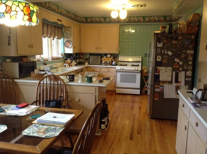
In this mid-century house, the kitchen was wrapped in linoleum and dated tile, with a peninsula cutting the space in two.  The homeowners love the influence of the Arts and Crafts style,  which drove the choices of warm cherry cabinets and a custom tile backsplash.  Our color inspiration came from a prized still life, passed down through the family, that has a place of honor next to the table.  Other special touches include a collection of plates hung above the sink, stained glass pendants that feature dragonflies, and an Amish-made table and chairs.

The original mid-century kitchen, with a peninsula cutting the room in half

 
Photo by Peggy Turbett

The new kitchen has a more open traffic flow, warm wood cabinets, stone countertops, custom tile backsplash and decorative pendants over the island. Photo by Peggy Turbett.

Color inspiration from a family heirloom

Colors in this painting are repeated throughout the kitchen. The wife framed the piece with hand-done stenciling.

Warm wood cabinetry and a stone countertop reappear on the storage hutch, located on other side of the room. Carefully planned lighting highlights a custom tile backsplash and glassware collected over the years. Photo by Peggy Turbett.

Making it Personal

A collection of plates above the window and stained glass pendants with dragonflies add unique touches. Light comes from multiple sources while a deep farmhouse sink with a bridge faucet provide function and character.

The Finishing Touch


 This lovely home had good bones and basic design, but it was missing something - the finishing touch that only custom window treatments can accomplish.  Unafraid of pattern and grand scale, the homeowner understood the importance of softening hard surfaces with beautiful curtains and valances.  The kitchen needed a simple treatment over the sink, while the hearth room was finished with shaped valances, edged in glass-beaded tassel fringe.  The great room is now dressed with long panels which sport a bold pattern.  In the dining room, goblet pleats, tassel fringe and rich subtle pattern in the curtains add a richness that elevates the grandeur of the space.   


2015-10-13 11.41.37 (2).jpg
2015-10-22 09.08.17 (2).jpg
2015-10-22 09.06.44 (2).jpg
2015-10-22 09.07.51 (2).jpg

A sensitive remodel to respect a century home


Poor storage and a difficult floor plan made this kitchen a challenge for the clients, who love to cook and welcome family and friends.  The objectives for this project were varied: improve the work space and storage while keeping the charm of the original space, and showcase some of the owners' collection of glass pieces.  Since the footprint of the kitchen needed to remain the same, and the clients wanted to keep the original floor,  this project had very specific parameters.  There was not enough room for an island, so I needed to carve out as much counter space as possible.  New kitchen cabinets, countertops and lighting made the main kitchen space more functional. Glass-front cabinets with glass shelves and interior lighting now highlight colorful glassware.  A new sink and faucet, plus custom tile backsplash, respect the history of the house while adding modern functionality.  In the breakfast nook, I kept the original light fixture and corner cabinets; these were painted blue on the inside, to highlight a collection of creamy milk glass.  Charming traditional curtains at the windows complete this cozy space.   


Widmann kitchen looking in adjusted.jpg
Widmann kitchen lighted cabinets.jpg
Widmann breakfast nook.jpg
Widmann kitchen closeup of sink.jpg
 

              "She is artful in incorporating family heirlooms into her designs all the while maintaining a fresh and current look in the finished product."       

                                                                                                               Karen K., Cleveland Heights

It started with a dutch oven!

Cooking is my client's passion.  She has a cobalt blue Dutch oven (with a place of honor over the stove), and it inspired the entire kitchen remodel.  Traditional maple stained cabinets were there when they moved in, along with laminate countertops and basic fixtures.  My client thought long and hard about how she uses this space, but she did not know how to put all of her ideas together.

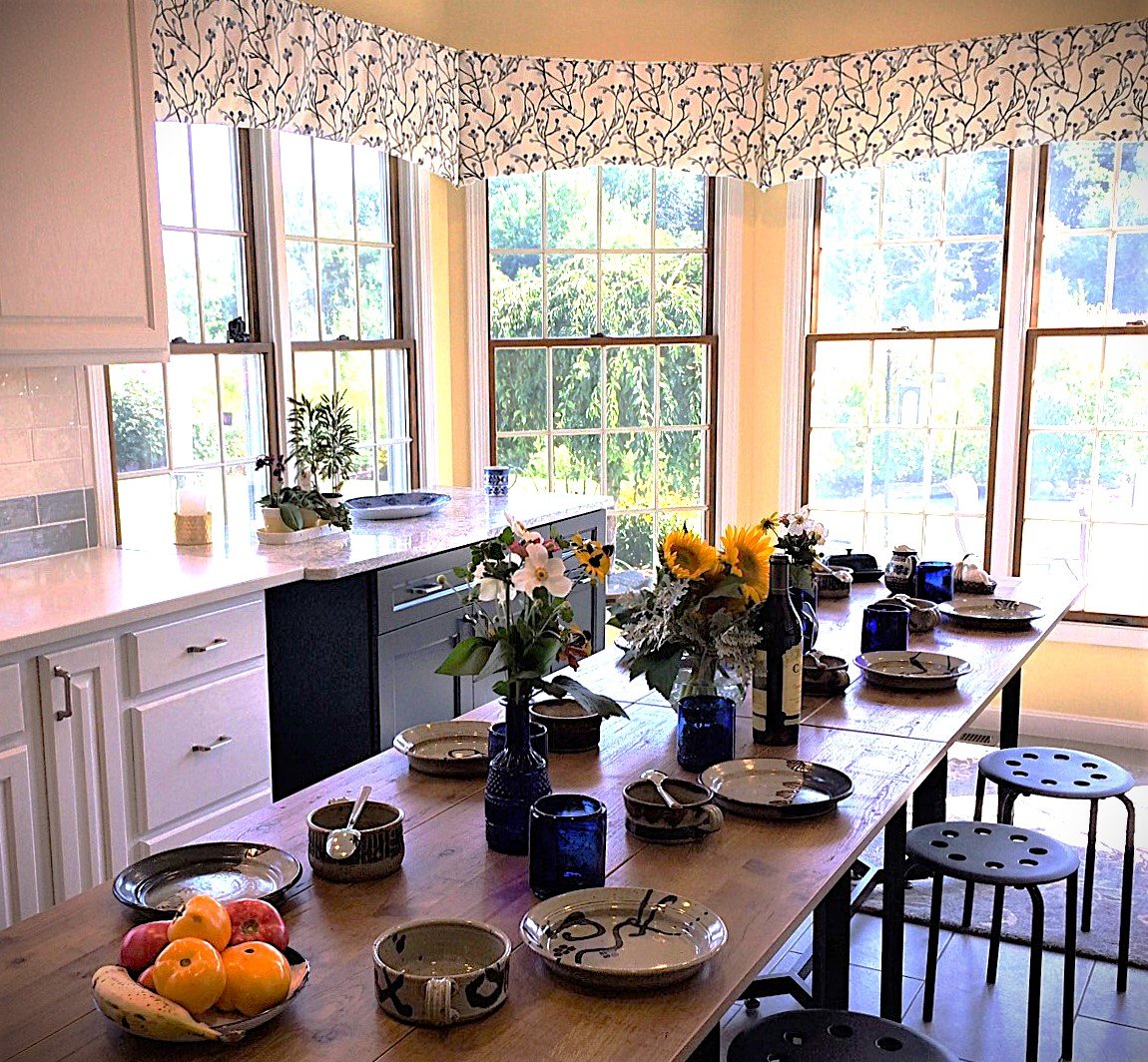
To brighten the room, recessed lighting was added, along with off-white cabinets and new tile flooring.  After many auditions for the backsplash over the stove, a beautiful mosaic tile won the vote and set the tone.  Unusual blue and grey field tiles carry the color scheme around the perimeter of the kitchen. In contrast to the light cabinets and quiet countertops, the island has a deep blue base, and a countertop made of stone that sizzles with visual movement and texture.

My client wanted total flexibility in this kitchen, so the island is on castors.  It is usually in the middle of the space, with available electricity from a floor-mounted outlet.  When she wants to host a crowd for dinner, however, the whole island can be unplugged and moved aside, near the windows.  Then, the tables by the windows can be moved into the middle of the room, their leaves extended sideways, to host as many as ten people.  Careful planning for all of her cooking tools - including a custom ledge for the yardstick used to measure rolled-out dough - makes this kitchen amazingly functional!  


Closeup of Dutch oven.jpg

My client’s blue Dutch oven and carefully chosen backsplash tiles set the tone for this kitchen.


Kitchen with island I.jpg
Kitchen full view with table in place.jpg
Intimate table I.jpg
Kitchenwith island view to frig.jpg
Emrich master bedroom adjusted.jpg

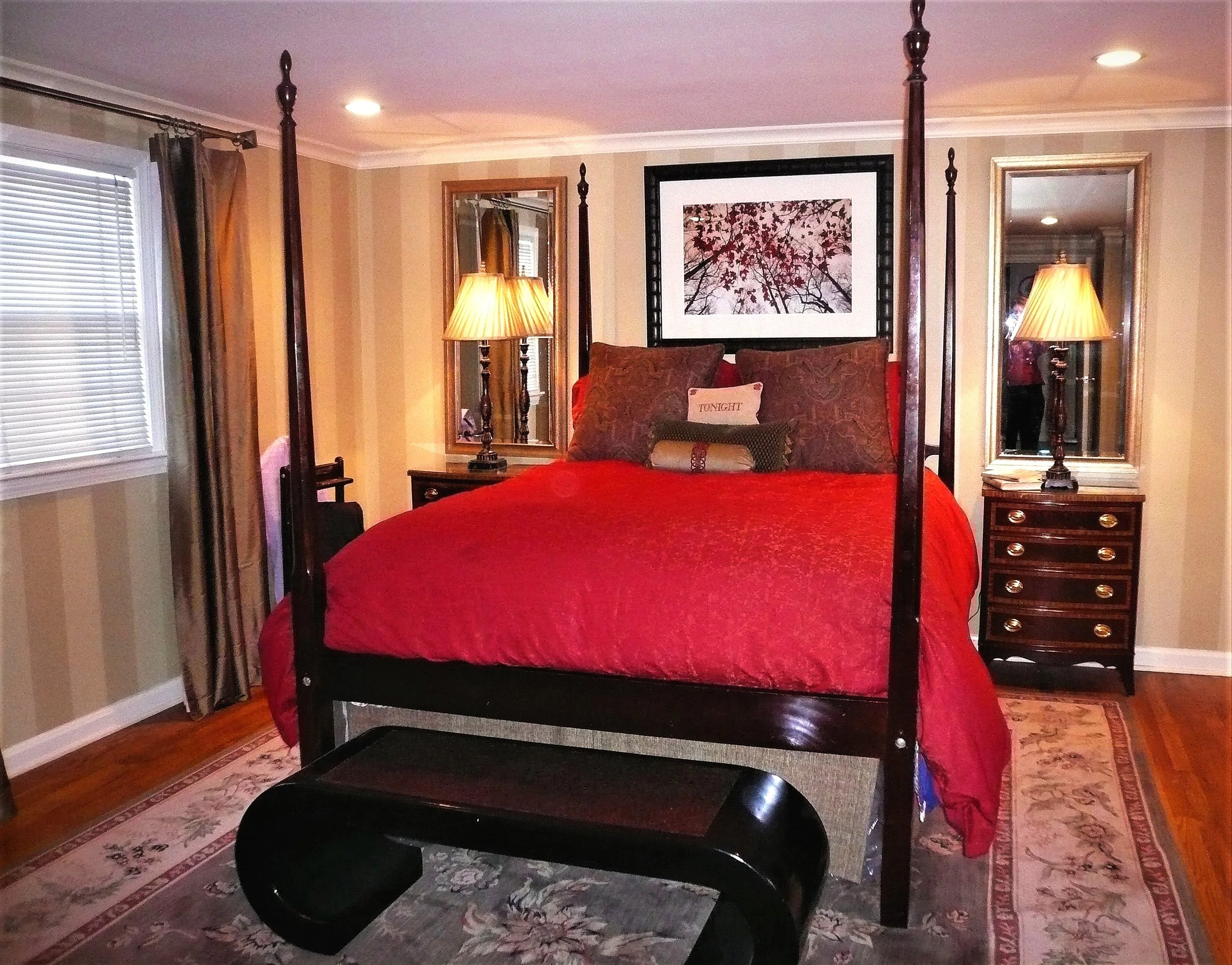
In the primary bedroom, 1980’s aqua and mauve florals are replaced with rich reds and golds. Vertical stripes on the walls make the ceiling feel higher, while the light from bedside lamps is is reflected in custom mirrors.

Emrich adjusted master bedroom alcove.jpg

A quirky niche in the primary bedroom commands attention with an antique chest of drawers and detailed valance.

Emrich adjusted powder room .jpg

This small powder room hits the big time with an overscale wallcovering, custom vanity and antique mirror.

Emrich adjusted beach bathroom II.jpg

Colors of sand and water in this guest bath suggest a trip to the beach. The plain hollow-core door is brought to life with hand-painted “panels.”

Emrich adjusted beach bathroom III.jpg

An oversize mirror above the vanity expands the visual size of the bathroom.

Emrich Dining Room BEST.jpg

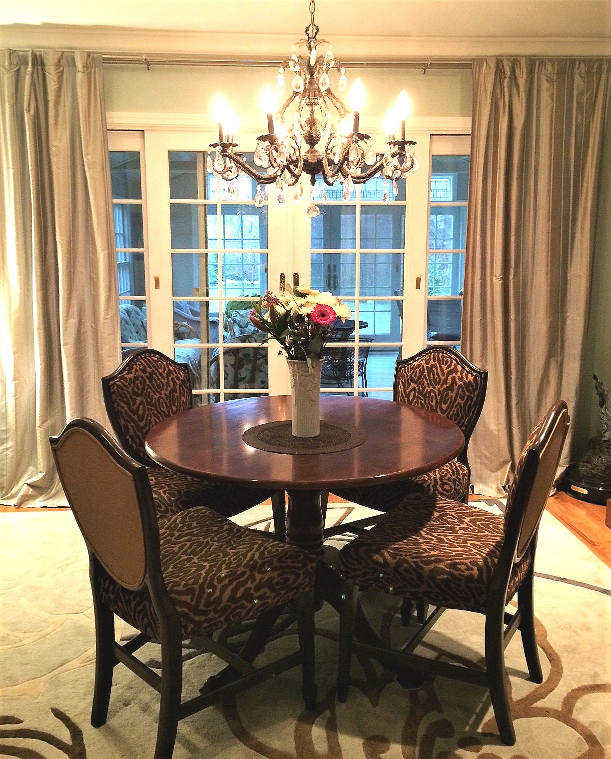
An elegant dining room was created from an under-used space. New French doors replace the window and open onto a screened porch.

In this traditional house, the master bedroom needed a change from the 1980's aqua-and -rose floral theme.  Rich browns, reds and golds create a welcoming atmosphere, while hand-painted stripes and floor-length curtains add visual height. …

In this traditional house, the master bedroom needed a change from the 1980's aqua-and -rose floral theme.  Rich browns, reds and golds create a welcoming atmosphere, while hand-painted stripes and floor-length curtains add visual height.  New recessed lighting in the ceiling and bedside lamps reflected in the custom mirrors add to the cozy yet sophisticated feel.  The powder room gets its zing from an over-scale wallpaper and a new, custom-designed cabinet along the side wall.  In the guest bathroom, I created a "beach" feel The subtle mood comes from floor tile and countertop in sand tones, and mosaic tiles that bring to mind colorful wet beach stones.  A vanity painted in soft blue, with shell-inspired hardware, completes the look. 

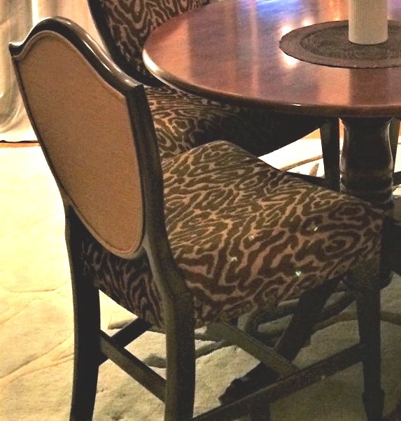
There was no dining room in this home, so I created one from a room that had been used as a study.  Antique shield-back chairs (with broken wood trim) were given new life with upholstery.  The lovely chandelier, an antique store find, was painted black; we had it softly washed with gold to dress it up.  Where there was a window, we had French doors installed, which open to a new back porch.  So, even though the dining room is small and cozy, it has the feeling of being much larger. 

traditionaloffice01.jpg
Piraino office Roman shade.jpg
After spending a career in law, my client was looking forward to retirement, with plenty of time to research and write a book.  An unused bedroom was his choice for creating a perfect office to house his many volumes and files.  He wanted …

After spending a career in law, my client was looking forward to retirement, with plenty of time to research and write a book.  An unused bedroom was his choice for creating a perfect office to house his many volumes and files.  He wanted it to be warm and comfortable, with plenty of desk space. Working with a gifted contractor and cabinetmaker, I designed bookshelves and file drawers.  With a large writing desk front and center, my client can merely turn his chair to use the computer, housed in its own custom-designed space.  

The light from the French doors and windows behind the desk is lovely, but the rest of the room was very dark.  We decided to take out a bedroom door on the opposite wall, and create new French doors, to balance the ones on the outer wall.  A wonderful thing happened:  since the new doors opened onto the stairway and tall window beyond, this room now became filled with beautiful daylight!  In the evening, warm light from brass fixtures shines on the books in the shelves, creating a warm glow.

The fabric for the Roman shades is a hand-printed linen, with rich colors that complete the gracious feel of this office.  

traditionaloffice03.jpg
Piraino office French doors to hallway.jpg

A Pub of One’s Own

Céad Míle Fáilte! “100,000 welcomes” to this warm and cozy Irish pub! This basement recreation room of a house built in the mid-1950s was so firmly rooted in mid-century style that “Happy Days” could have been filmed right here. It was ready for a facelift and the home-owners (she from the Cleveland area and he from Dublin, Ireland) decided that they would like an Irish pub in their basement. When we sat down to discuss this project, it became clear to me that they wanted to have a place that reminded the husband of a welcoming neighborhood pub that he might have visited back home in Dublin. He also requested a comfortable seating area in which to visit with friends, watch TV or listen to music, as well as storage for his CD’s and DVD’s.

Out went the wrap-around bar with fluorescent lighting and the linoleum flooring. In came new wood-look vinyl plank flooring, recessed lights in the ceiling, and two shades of “Dublin blue” paint on the walls. The knotty pine paneling, wood back bar and original fireplace (now with a gas insert) added to the overall feel so they were retained. I designed a new bar, the base painted in our “Dublin blue” and the top stained cherrywood, which was custom-made by Eastwood Furniture. The paneling and corbels gave it a traditional look, while the beverage cooler tucked into one side offered wonderfully modern convenience. We used the homeowners’ original maple barstools, which blended nicely with the design. Above the bar we added hand-blown recycled glass pendants from Bicycle Glass Company.

Original 1950's bar

ORIGINAL 1950’S BAR

NEW BAR IN “DUBLIN BLUE'“

My vision was to create a rich, layered look, as if the pub had grown in place over many years. While the bar would dominate one end of the room, I also envisioned a sectional sofa for the TV area, a table and chairs for dining or card games, and intimate seating for two by the fireplace. I scoured many antique shops and consignment stores to find special pieces for the room, often dragging my very patient clients with me. To our delight, we found two oak presiders’ chairs at an antique shop on the west side of Cleveland. They were probably 100 years old, from an unknown church; the traces of red paint which would signify the honorable place of a priest or bishop were still visible. They now sit in close proximity to the fireplace, waiting for visitors to share a glass of whiskey and quiet conversation. Behind them, on either side of the fireplace, I added custom storage shelves.

On the other side of the room, behind the bar, we needed storage for the homeowners’ many bottles of spirits, gifts from family and friends. I envisioned two antique cabinets, one for each side of the back bar, to hold liquor bottles and a collection of Guinness pint glasses. After visiting half a dozen shops, we found two antique wood and glass cabinets, just the right size and style. The pub table seemed to be waiting for us in the loft of a barn, its quarter-sawn oak surface nicely patinated with the bumps and dings of one hundred years of use. Likewise the chairs were found on the second floor of an antique shop.

The sectional sofa, upholstered in a sage green chenille, was a nod to more contemporary comforts, as were the wall-hung TV and state of the art sound system. A leather-topped ottoman, also from a consignment store, now serves as a coffee table; wooden trays stored on a lower shelf are handy for drinks and snacks. The handsome walnut and leather console under the TV came from the Baker showroom at the Ohio Design Centre.

The homeowners have collected posters and artwork from Ireland for many years. We had the large pieces matted and framed by Wood Trader, then spent a day hanging all of these treasures. Over the mirror behind the bar is a special piece - the Irishman’s hurley, a stick used to play hurling, the national game of Ireland.

The homeowners are now happy to welcome family and friends to this cozy nod to Dublin, to raise a pint and cheer “Sláinte!”

Photography by Peggy Turbett.

  Coffee, Please!

My clients have a lovely home whose architecture references the French Art Deco style - sleek and sophisticated. The kitchen, which was remodeled in the 1980’s or 1990’s, did not live up to the style of the house, however. It is a small kitchen with a breakfast nook off to one side. The husband and wife both cook a lot and both love to drink coffee, making for major traffic jams. Lack of sufficient storage contributed to clutter, while a large microwave over the stove made the room seem claustrophobic. The illumination coming from one ceiling fixture and one pendant over the sink wasn’t enough to prevent dark corners on the countertops, which were fabricated with granite tiles. My clients were definitely ready for an update!

Original kitchen - cramped, dated, with dark corners on the counters

The bright new kitchen, with light bouncing off reflective surfaces

I did not change the footprint of the room but made significant changes to all of the surfaces. The new floor, countertop and backsplash brighten the kitchen. They also reflect the light that washes the space from new ceiling fixtures, a custom pendant over the sink, and under cabinet lights. The cabinets remained but were given a facelift with paint. To blend with the new stainless steel appliances, I chose a soft French grey for the upper cabinets, and then used a slightly deeper shade for the lower cabinets. This grounds the room visually, while the very slight color changes keep the kitchen visually more expansive.

New heavy-duty exhaust fan above the stove clears the cooking area quickly, while a stainless steel backsplash makes cleaning easier

My clients wanted a coffee station in their kitchen, so I needed to carve out more workable space from this existing room. The original pantry/ broom closet, opposite the sink, offered a possibility. There was a lot of empty space around it, so I thought we could use it differently. The contractor discovered that there was even more unused space than I realized in this wall, so I was able to create a coffee bar with cabinets, plus a spot for both the microwave and toaster oven. Now it is easy to make coffee without getting in the cook’s way!

Original pantry/broom closet, only utilizing part of the wall space

The new coffee bar, with plenty of storage and spaces for the microwave and toaster ovens

Off the kitchen there is a charming breakfast nook. My clients had a a bistro table with counter stools, and some framed prints from a big box store. They were tired of having to climb up and down from the counter stools and so did not use the nook very often. I knew that we could make it more comfortable, while adding personal charm. I found an antique pub table and a comfy banquette, which was upholstered in a performance fabric for cleanability. A couple of pull-up chairs fit nicely into this cozy space, while a new pendant over the table adds soft light.

My clients had told me about their trips to Germany, to a little town which had captured their hearts, and they had taken some very nice photos. I suggested that we use these in the breakfast nook, so we framed and grouped smaller photos on one wall. Then we chose a special image and had it blown up, printed as a giclee on canvas, and mounted it on the opposite wall. The effect is like a window that looks out onto the village that is close to their hearts. Now the nook is not only functional but a deeply personal space where they love to linger.

The original breakfast nook, with bistro table and counter stools

Re-imagined breakfast nook with pub table, banquette, pull-up chairs and personal photography

  The Jewel Box

The couple who live in this large Tudor-influenced home has a deep appreciation of traditional architecture, contemporary art and treasured family pieces. When they were ready to give their living room a facelift, they wanted a sophisticated space that reflected their interests and personalities. They were unsure how to approach a project like this, however. I suggested that we use their beautiful Oriental rug - a family heirloom - as the starting point, with its open pattern and jewel tones of ruby and periwinkle woven into the design.

A neutral background for the room was created by color-washing the grasscloth-covered walls a soft celadon green, which highlighted the room’s wood trim, detailed cornice molding, and plaster border above the fireplace. I then layered sheer draperies with a contemporary linear pattern at the windows. The existing baby grand piano stayed in place, anchoring one corner of the room. Custom lighting was added to the ceiling to highlight the couple’s collection of contemporary art.

For the seating arrangement, I had trouble finding loveseats that were exactly the right size and style, so I designed these two loveseats and had them fabricated and upholstered in periwinkle blue velvet. The armchairs bring bursts of pink and ruby from the painting over the fireplace into the center of the room, while a comfortable lounge chair echoes the soft green of the walls. To add some sparkle, I incorporated glass and brass tables, an oval mirror with crystals around the frame and a floor lamp with a hand-blown glass shade in rich jewel tones.

Custom lighting highlights artwork in the music corner, while the floor lamp adds colorful sparkle and dramatic shadows on the ceiling

Another corner of the room is home to a burlwood chest, topped by a silver-gilded disk on the wall. Since the couple entertain frequently, I knew that extra pull-up chairs would come in handy. To accomplish this with custom style, I designed two Klismos side chairs with black lacquer legs and supple leather upholstery in bumblebee yellow, edged with silver nailhead trim.

The “jewel box” has played host to many gatherings, with a very personal and sophisticated style!

Yellow leather Klismos side chairs pick up unexpected colors from the artwork, while lighting creates an interplay of light and dark on the wall

The Next Chapter

  These clients are planners! When they asked me to help them with a primary bathroom re-design, they said that they want the bathroom to function for them now and also in the future. In the present, a soaking tub was a necessity, while in the future, they wanted to assure that a wheelchair could maneuver throughout the space.

Many details were discussed so that this couple can age in place. What they wanted is called “Universal Design.” This is a process of creating spaces and products which are accessible to people who may have disabilities as well as everyone else. We wanted to go further, however, to create a space that fit into the Universal Design parameters, but was also beautiful.

The original corner tub, tile backsplash, flooring, cabinets, countertops, lighting and mirrors would all be replaced.

My clients, who had a history of boating and being around the water, wanted a beach feeling for their bathroom. Colors of sun, sand and water now surround them. The sleek soaking tub and gracious chandelier add a spa-like elegance, while painted beadboard and cabinetry create a feeling of cottage charm.

A walk-in closet on one side of the bathroom, away from the window, was relocated to the bedroom, giving us a bigger footprint to use. The wife really wanted her soaking tub and her own vanity; I dressed it up with a soft valance and chandelier. Opposite from the wife’s vanity, there is another vanity, designed at the proper height and lower cutout required for a wheelchair. A standard walk-in shower was replaced with a larger Universal Design shower; it is roomy enough for a wheelchair to roll in and out, with a zero entry clearance. The corners of the new bathroom now have two new cabinets, large enough for towels, toiletries and lots of extra storage.

The wife tells me that everyone loves their bathroom, even their children. We succeeded in creating a bathroom that is functional for people with all kinds of abilities - good Universal Design. It is also beautiful enough to appeal to different generations, and many chapters of life.

A second vanity allows plenty of room for a wheelchair and is situated at the proper height. In the corner is a large storage closet. Details like a heated floor and mirrors that light up around the edge make this bathroom welcoming and comfortable.

The spacious shower, with tile accents in watery blues, has a “zero entry,” meaning that one can walk in or use a wheelchair, because there is no raised edge.

My clients now have a bathroom that will function beautifully for the next chapter of their lives.

New Life for a Loft

Sometimes design can involve using what you have in a new way. My client wanted to improve his loft to create a cozy guest suite, but wasn’t sure how to go about it. I had a skilled artisan repair cracks in the plaster and give the whole space a fresh coat of paint. Then I looked around my client’s home to see what we could incorporate. Chairs, bookcases, lamps, and accessories were employed to create a unique sense of place - a very comfy guest suite that speaks to the many interests of my client.

My client had many unusual pieces that were not being used to their best advantage in other parts of his home. Here they create an artful niche, a cozy reading corner and a stylish guest room beyond.


The brass statue of an Indian goddess was lost in the library downstairs, and the area rug had been rolled up in a corner.

This narrow niche cried out for a purpose in the loft. I coud have chosen to add shelves but instead I decided to highlight this interesting statue and use the Oriental rug as a backdrop. The only items purchased for the loft were the rod and rings to hang the rug, a pedestal for the statue, a mattress and box springs, bedding and an antique carved mahogany headboard, found at a consignment shop for under $100.00.

A new guest bedroom tucked under the eaves


New drywall and paint in the basement

The seating area in the new playroom

The play area is just off the seating area, offering active play with imaginitve toys for grandchildren of different ages.


My clients decided to reimagine their empty basemwnet into a playroom for visiting grandchildren. but they were not sure how to proceed. I came in after the contractors had put up drywall and painted. They were getting ready to install new vinyl flooring over the concrete floor. After a long conversation with my clients, we decided to create two areas - one for quiet reading or watching a movie, the other for active play, crafts and puzzles.


For the seating area, I introduced pieces upholstered in primary colors - red, yellow and blue - in sturdy washable fabrics. A big square blue ottoman anchors the space, acting as a coffee table, with soft corners that will not endanger a wobbly toddler. The yellow swivel chair is fun for both adults and children, while the red sofa and loveseat offer lots of cuddle space. A braided rug softens the floor while another ottoman, upholstered in a brightly-colored kilim, adds flexible seating. I love the fact that my clients opted not to hang “art for kids” on the walls, but chose pieces from their own collection to share with their grandchildren. The play area has a child-size kitchen, tables and chairs, a dollhouse and a bank of built-in shelves to easliy store and retrieve toys and books. On the floor, a soft mat is perfect for babies to sit and roll on, while it absorbs the impact of dropped toys. We included a couple of closets for storage, too.